A Car's Persona: Chrome Lettering and Emblems
A Car's Persona: Chrome Lettering and Emblems
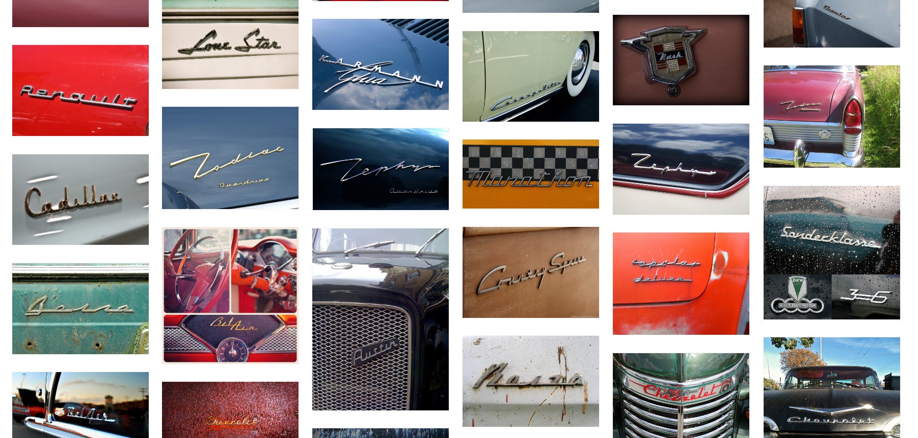
The underappreciated signature art of your car's chrome brightwork

My cousin Tom Dempsey introduced us to the under-appreciated auto-art work of Stephen Coles. Stephen sees the world with an artist’s eye especially when it comes to lettering and fonts. He wrote the book The Anatomy of Type and was a creative director at FontShop.
With his right brain insight he saw that the various emblems and chrome lettering on older cars — the “bright work” — as not just the label and name for a car but also a main source of its personality. He feels this is especially the case for the mid - twentieth century cars (50’s and 60’s). [He “…rarely find[s] anything of interest that was produced after 1985.”1]
These images and description come from the Presentation Stephen made at Creative Mornings in Berlin, referenced belowHe sees the beauty of many of these labels and emblems and felt that no-one seemed to be archiving, cataloguing, saving them. That set him on a project to photograph, label, tag and publish them. With photos he could capture beautiful, BIG images of chrome emblems with a nice clean background of color. In his view this technique highlights them as beautiful pieces of art. He publishes the photos — his own and other contributors; currently over 3000 images — at his site Chromeography.
Notice how these particular photographs from Chromeography convey the personality of the Chrysler Imperial:
The script reflects Merriam-Webster’s definition of ‘Imperial’: “sovereign, regal, imperious; of superior or unusual size or excellence”2
And Saab offers a great example of personality. Stephen considers their airplane logo one of the best emblems as it speaks to Saab's roots as an airplane manufacturer and sadly they retired it.

Best wishes, Saab. We hope you end up in good hands. On that note, here’s one sad story on the bankruptcy.")
Stephen explains that the chrome lettering of the 50’s and 60’s evolved from the advertising design landscape of the 30s 40s 50s which featured hand lettered scripts. They designed logos and signage with scripts and this carried over to the automobiles and their logos. He continues that beyond the stylistic concerns, scripts offered a functional device. Chrome emblems had to come in one piece for manufacturing purposes so this meant design decisions to keep all of those letters together…as in this “beautiful connection” to keep ‘Sport’ and ‘Fury’ all one chrome piece:

And, Stephen goes on to explain, Plymouth Fury lettering in particular also shows the evolution of design at the time. Designers began combining basic script and elements like stars…
")
…or space ships or as Stephen puts it this “star trek-ish rocket thing…”

He points out that the U.S. at this time was in the space race, an optimistic time.
But achieving this linkage across the letters mostly involves what Stephen refers to as a “Baseline connection” — flat lines at the base of the letters that keep them together. This style populates many cars of the era:
")
")
Auto designers also liked the baseline connection’s sense of motion and speed.
Designers used this baseline lettering to also describe features of the car, such as transmission’s names like “Dynaflo” or “Ultramatic”.

Stephen describes the difference between font design and lettering. Lettering involves the design of multiple letters together into a word or phrase as pictured in all of the above. Font design focuses on the design of each letter unto itself. Yet, he points to some fonts designed to enable the creation of “lettering-looking” outputs using character entry. One good example is the Magneto font from CabargaType which can produce lettering like this:
Stephen also points out how designers of this period may have matched the emblem and lettering to the shape of the car so that the emblem or name echoes the shape of the car. He points out the way the emblem for the 1971 Peugeot 504 matches the shape.

The front of the car has the same angles as the emblem. If you look at the four in 504 you see it echoing the shape of the right headlight. The 504 label “is” the car.
My point is that Stephen Coles’ website Chromeography offers WONDERFUL views of the brightwork of beloved cars, some of which are ‘old friends’. The Chromeography site allows you to search and retrieve specific car or model names like “Sprite” (Austin Healey)
")
Or even colors…like “Yellow”:

Or retrieve them by name or class or type, etc. And more importantly you can contribute — offering your own interesting photos of unique auto art emblems and lettering to the site as the historic archive grows.
Please take a look at Stephen Coles presenting his work at Creative Mornings in Berlin.
https://chromeography.com/post/109251174606/1963-chrysler-imperial-emblem-recreated-by
Definition of imperial. (2022, December 25). Dictionary by Merriam-Webster